A few months ago, the owner and director of fledgling micro-brewery business, Badgworth Brewhouse contacted me with a mission to breathe life into his brand and its eight new drinks.
The brand's mascot is based on his son, who has always been a prominent feature on the products.
To begin, I researched the brand, and its competition. It was then I discovered just how much of an impact we needed to create with this project as there are quite a few other micro breweries dominating the market. In order to get noticed, we needed to play on the personality of the brand and reflect this in the new brand guidelines, can wraps, pump clips, and new wall mural that had been commissioned.
First, I needed a tight colour palette and logo design for the brand, that would make it memorable and eye-catching. Simplicity here was key. 

With a simple base palette, I could utilise a brighter, more eye-catching palette for each of the eight products in the new Badgworth Brewhouse range. 
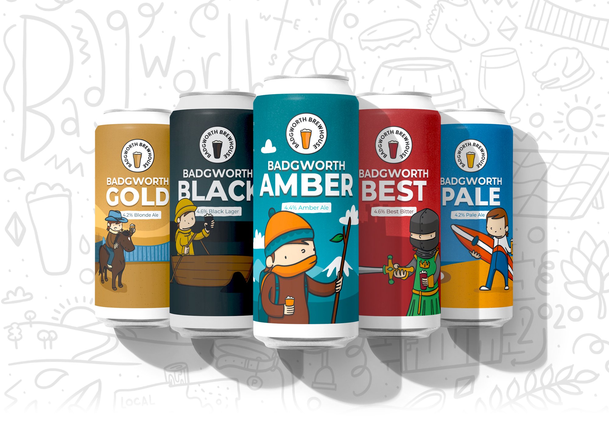
With these colours, I set about building an individual personality for each drink, using illustration as the basis for each of the products' can wraps and pump clips. Below is the palette for one of the drinks: 'Badgworth Amber'.
After each new product identity was approved, I set about designing the layouts for the labels. This included sourcing a font, measuring spaces for barcodes, including social icons and integrating product name and brand story onto each label. 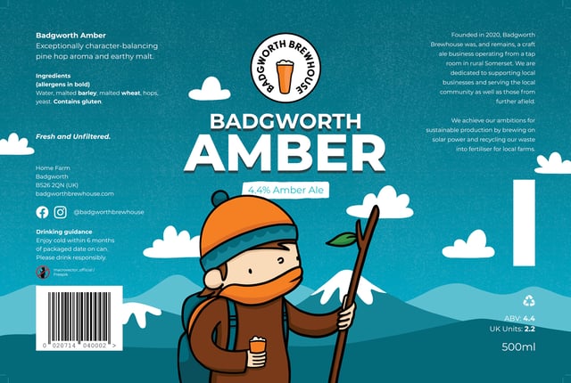
The layouts were then applied to the drinks cans as speciality labels.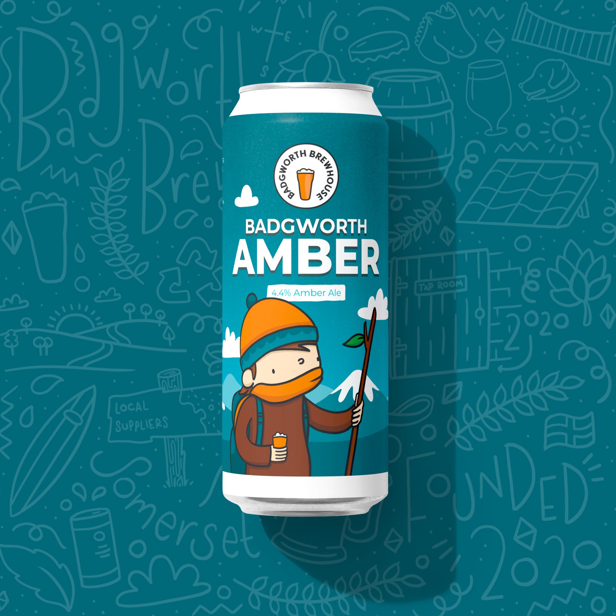
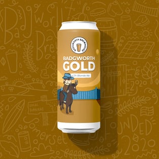
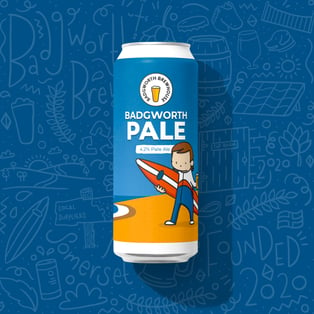
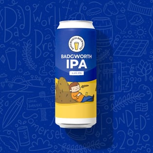
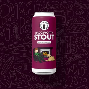
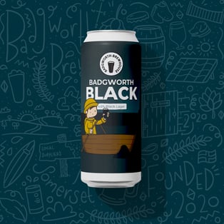
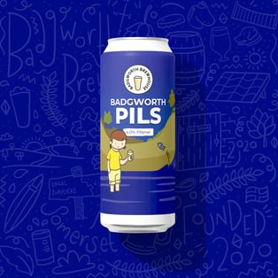

Pump clips were then printed using a slight variation on the size and placement of the can wraps. 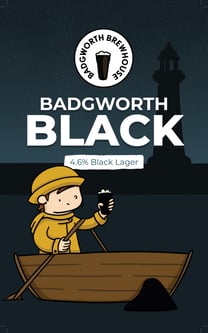
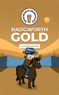
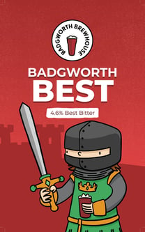
After cementing the look and feel of the brand I captured this in a brand guidelines booklet that the business could refer to going forward to help them secure a consistent look and feel for their brand.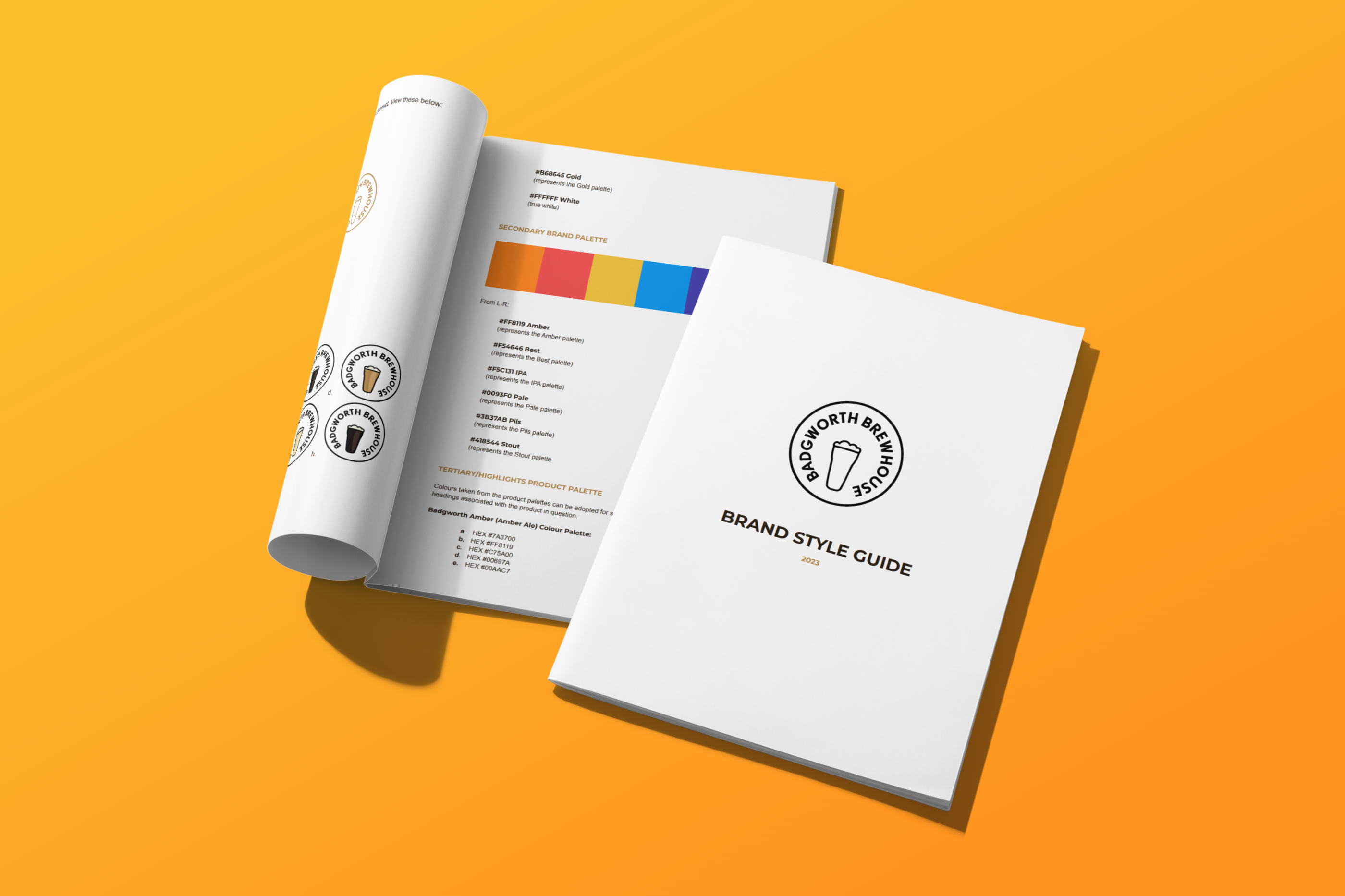
Lastly, I created a wall mural for the brands premises using a 'scattergun' illustration approach, and detailing elements of the business that made it what it is today.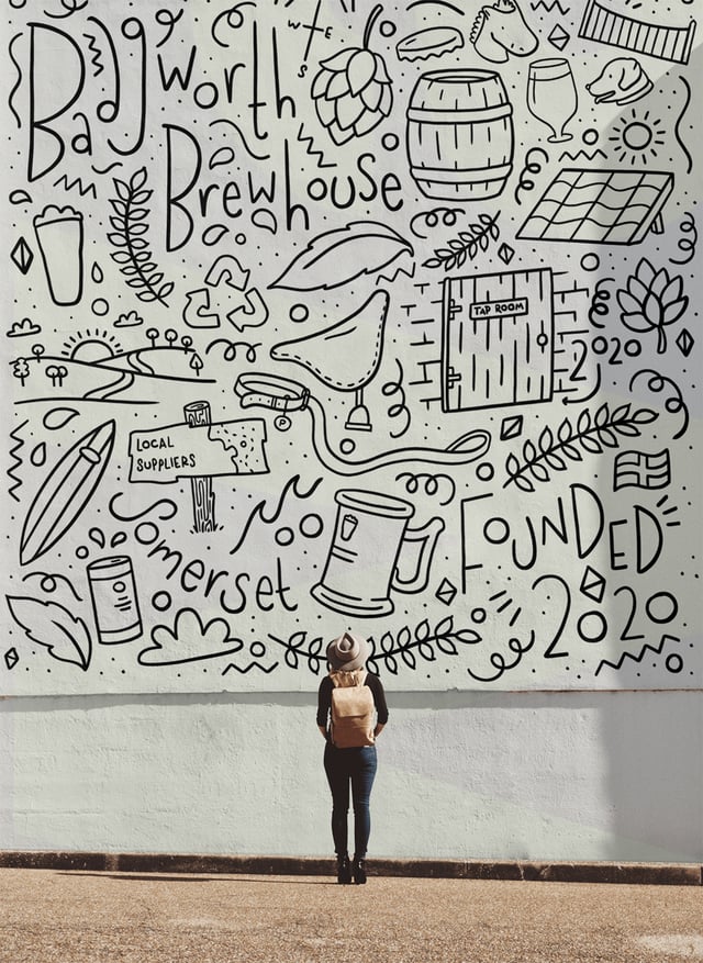
If you are looking for a fresh new approach to your branding, or need help giving it an update, please send your requirements to me on hello@tinygrey.co.uk.
Pop over to visit Badgworth Brewhouse online here: badgworthbrewhouse.com.
Sophie
Author

Sophie Scott-Lewis
I'm Sophie, an illustrator and graphic designer working on: branding | wedding stationery | portraits Represented by Lemonade Illustration Agency www.tinygrey.co.uk
Comments