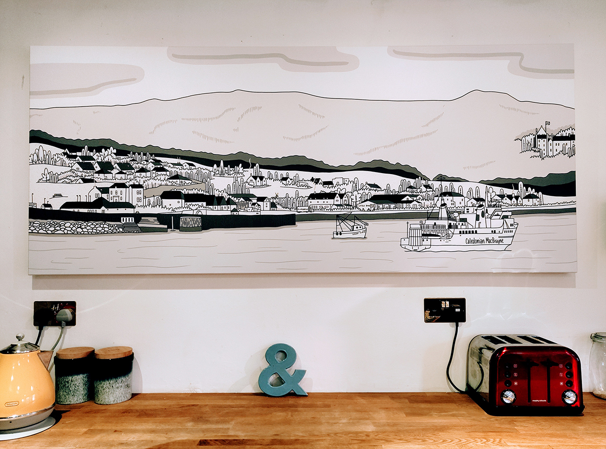
New Landscape: 'Brodick, Arran'
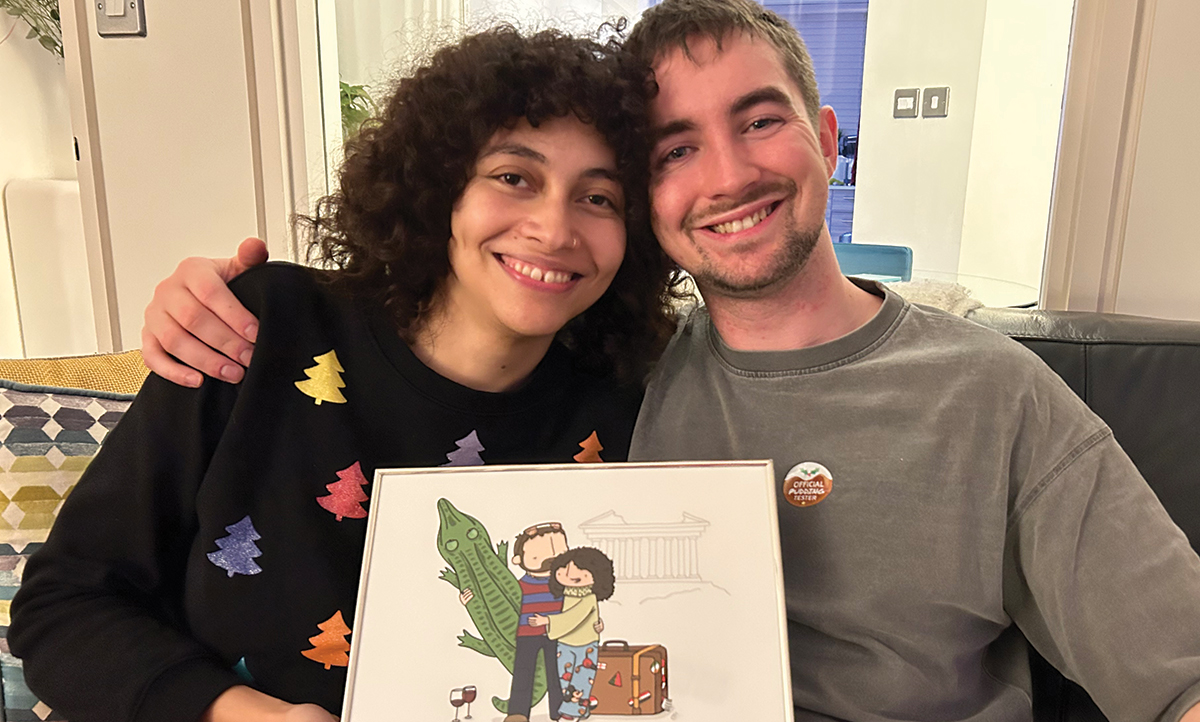
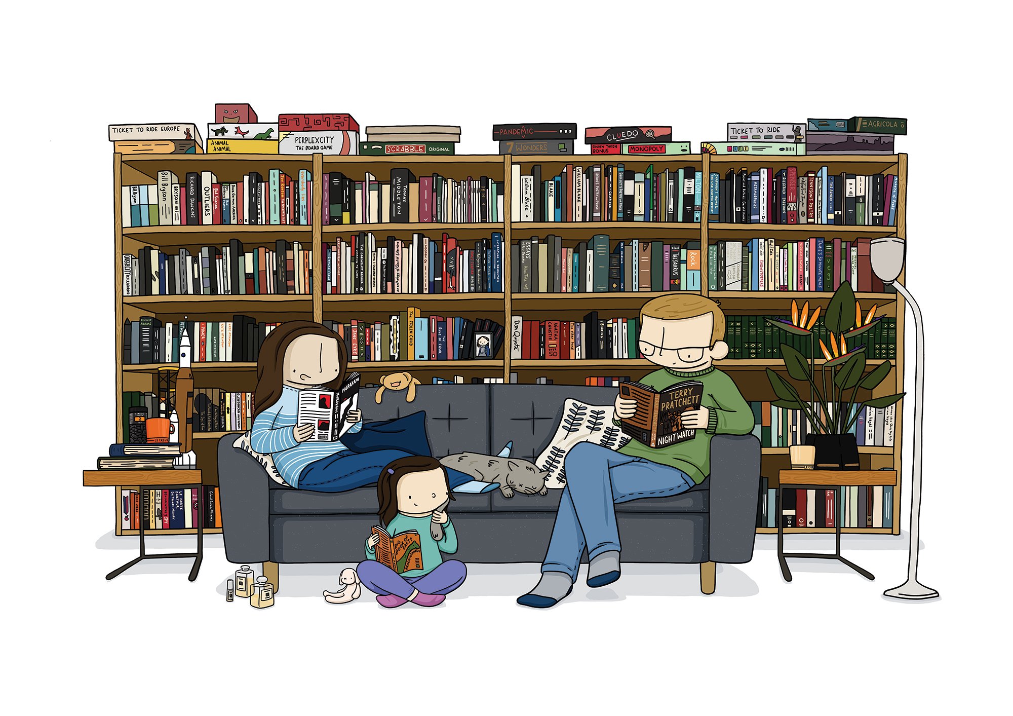
Last month, I posted on my social media channels that I was working on a top secret artwork for my wife, Zoe's, secret 40th birthday weekend (luckily she isn't on social media, so didn't see). The...
Last month, I posted on my social media channels that I was working on a top secret artwork for my wife, Zoe's, secret 40th birthday weekend (luckily she isn't on social media, so didn't see). The...
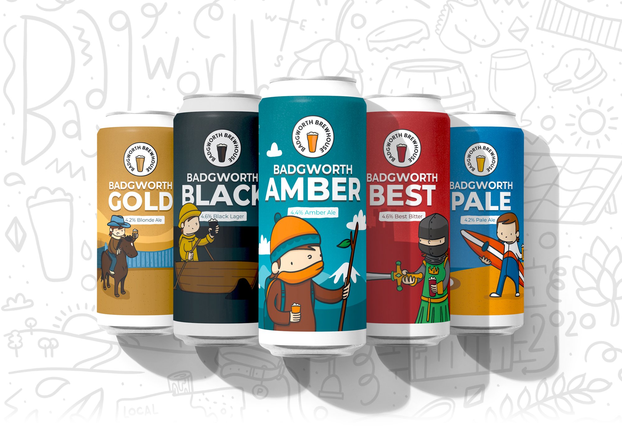
A few months ago, the owner and director of fledgling micro-brewery business, Badgworth Brewhouse contacted me with a mission to breathe life into his brand and its eight new drinks.The brand's...
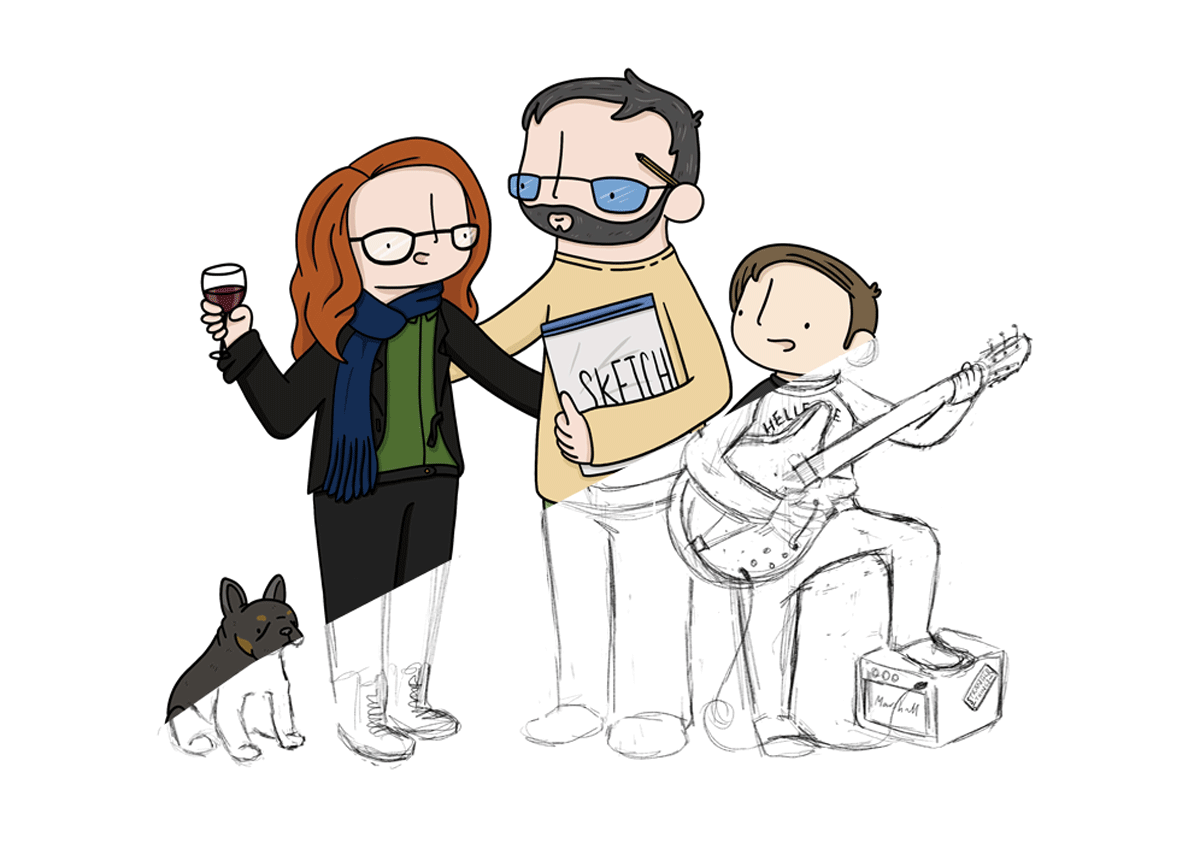
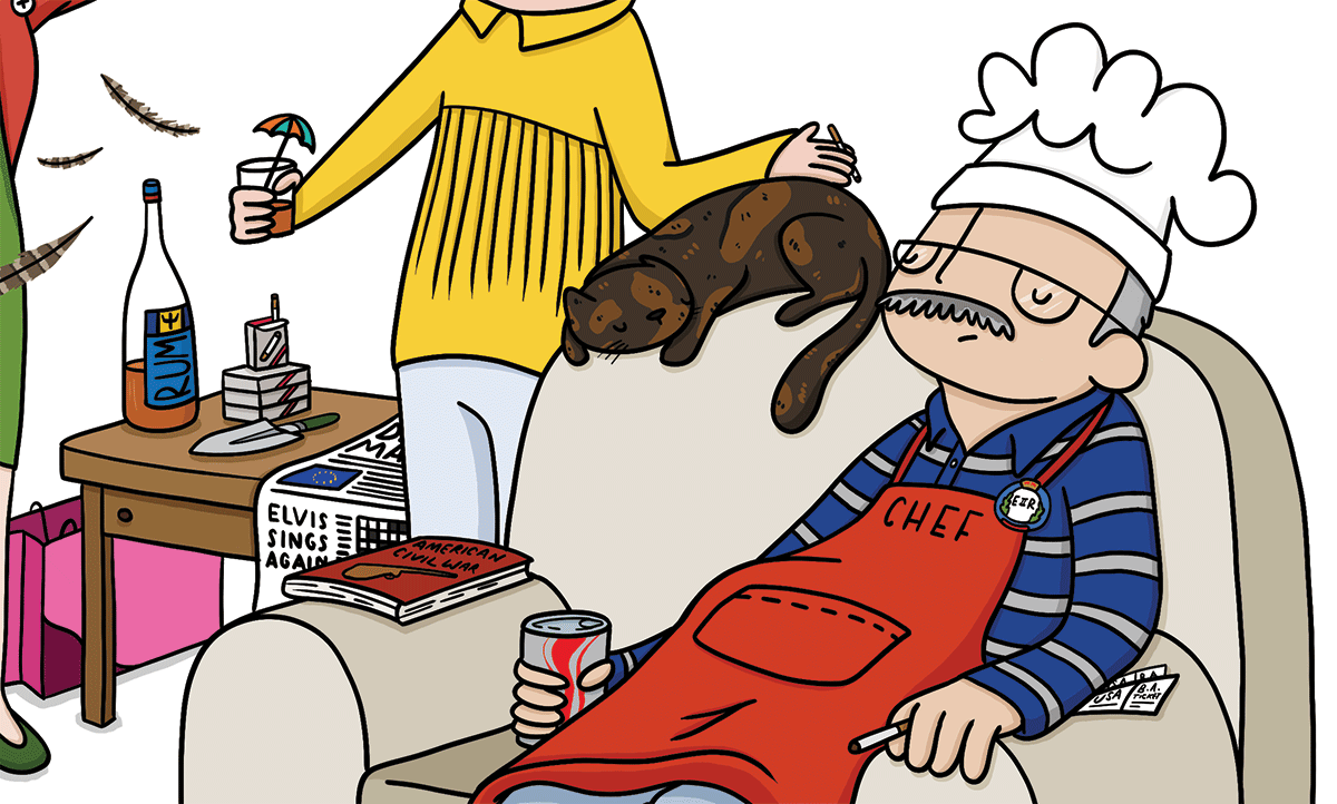
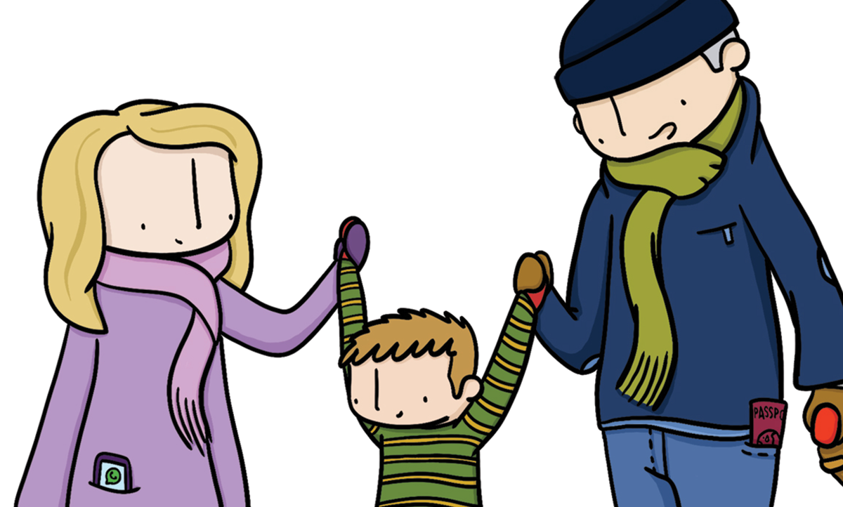
As an illustrator, I am keen to impress my customers with bright and vibrant representations of themselves, their partners, and their families. But the all singing, all dancing illustration that...